If April is the cruellest month, then May is the month of utter madness when the weekends become extensions of the working week and thriving is renamed surviving… I am tired. Still, it has passed, many totally uncrafty things got done, but a few crafty ones snuck in there as well.

May is also the month of birthdays and the joy of machine embroidery is a can finally indulge my friends as I think they deserve (they are probably all wondering what they did to offend me!) with something handmade and customised. I feel like I’ve been a bit of a mass card production facility recently but I think I’ve finally got my workflow to the point where designing and making a card is less effort than trying to find something nice in the shops.

One effect I had really enjoyed playing with was using foam to give a raised, three-dimensional look to the embroidery. You can see this on one of my other monograms. It had been really very straightforward to do at the class – just switching off any underlay stitching and upping the satin stitch density. However, it’s one thing doing this on someone else’s professionally maintained Tajima and another thing trying to get it working at home…

The design is an adaptation of one of Mary Corbet’s monogram collections. The small modifications were partly to make the design easier to stitch in a machine format but also to try and make it look more like a G… I’m still not completely convinced it does but at the same time I’m also not sure what other letter of the alphabet it could convincingly be either. I cut down on some of the embellishments but kept a few that I just ran as some running stitch before laying the foam on top for the real thing.
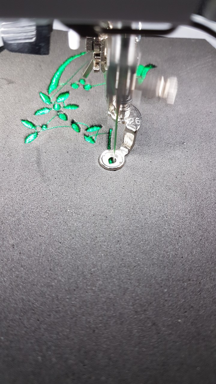
I’ve used 2 mm foam for this design which definitely gives it a very bold, raised look and I am pleased to report that it doesn’t slip badly on the felt at all. I probably shouldn’t admit this but I didn’t actually secure the foam in any way, just kept a gentle hand on the machine for the first few stitches. My first test design did go relatively smoothly but for reasons I don’t quite understand the machine registration decided to have a bit of a stutter, meaning that the design is misaligned in a section. I had thought those spiral shape (which are utterly awful to digtise without sending the stitch density off to ‘guaranteed bird nest’ levels) would be the problematic region but no, it just decided in the middle of what seemed like a smooth run to throw a tantrum. Still, this is why it was a test and I was happy to see most of the design worked out okay.
I’m getting a bit better at translating ‘screen size’ to reality and nearly successfully overexaggerated the gaps between the floral parts and lettering to ensure they did show as clear gaps on the finished design. This mostly worked okay. The other big challenge was really getting good stitch angles in to keep the flow of the shape. This is where I am so glad I have a traditional embroidery background because it really helps to see those lines and angles and has given me some strategies for dealing with the tricky ‘splits’ on the letters. They might look innocuous but it is quite hard to get a smooth transition from a single wide satin stitch to two individual branches, especially on foam where you can’t break the satin length at all without causing issues on the design height.
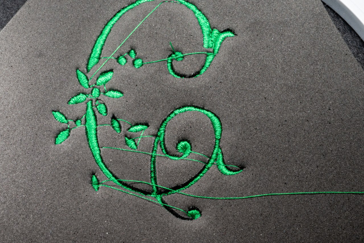
I did improve the pathing a little from test 1 to the real design because I hate jump threads and some parts just didn’t make sense. It is so easy to get lazy with the sequencing sometimes. I would love to say I always work in a logical and systematic and planned order when tackling a shape but the more complex it is and tired I become the more it becomes ‘what part I fancy doing next’.

Second time around things very much ran like a charm – the foam is surprisingly easy to remove but there’s definitely parts where a sharp pin, tweezers and a bit of courage are required. I might give some thought as to how to do the tips of the leaf shapes to see if I could give them a bit better definition, they look fine but a few more securing stitches might have helped them fare better in retaining their shape as the foam came away.
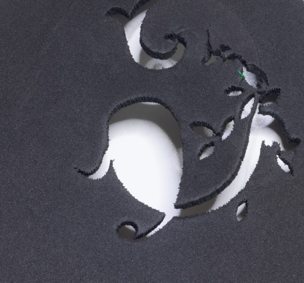
Overall though, I like this design very much. Worth giving the foam a poke and smoothing the threads for a better finish but it was surprisingly easy to adapt for the raised embroidery and this is just the perfect height. I love ridiculously raised embroidery and this to me has the right amount of punch.


Agreed – I think it looks sumptuous!
LikeLiked by 1 person
Thank you! That’s my favourite adjective for embroidery.
LikeLike
That is lovely! You are really doing a lot of experimenting and making a lot of progress with your art 🙂
LikeLiked by 1 person
Art feels like high praise indeed 🙂
LikeLiked by 1 person
Oh, well played indeed! Sometimes I think the advantage of machine embroidery might lie in being able to make a lot of mistakes very quickly, but then you learn not to make those mistakes and come up with this!
LikeLiked by 1 person
Haha, rapid mistake prototyping! I like it. I think the speed does help remove some of the mistake ‘fear’ as it’s not ‘I’ve just spent 80 hours on those few rows of long and short stitch!’
LikeLiked by 1 person
Just so! Although at the moment, my gripe concerns the time I’ve spent unpicking….!
LikeLiked by 1 person
Good luck, it’s always painful..!
LikeLiked by 1 person
[…] has very much been the craft of the year for me. I’ve learnt lots of funky new tricks, from using foam to create three-dimensional structures to using cutting tools to take some of the challenges out of […]
LikeLike