lThank you all for your very lovely and thoughtful comments last week. Interesting as well to see how many of you also felt that you didn’t want to blog about the ‘thing we talk about all the time but don’t really want to discuss’. I’m afraid it’s not quite shiny things for this week’s outing, but is an adventure in digitising and the joy that are ESA fonts.

Huge thanks to the wonderful Andrew Kenny over at the London Embroidery studio as I think that course really helped me find my confidence for ‘just doing it’ with digitising and to realise that actually, digitising a design isn’t necessarily a hugely time-consuming process either, particularly for the small areas designs that I use for my cards.
I really like having the card to use as a constraining factor for the designs and making something perfectly to fit in the aperture. One of my frustrations with a lot of the beautiful and wonderful designs available for download out there is they always seem to be rather large. This is great for making something really realistic with a lot of detail, but it also means that they don’t resize well, and I’ve found even rescaling by 5 % can be enough to turn a design from a smooth running piece to bird’s nest hell.
Today’s piece is homage to the charming Alpine flower, and common symbol of Switzerland, the edelweiss. If you’re fortunate enough to own a 5 CHF coin, you’ll find a particularly beautiful example on there and they apparently start growing at an altitude of 2000 m. Apparently Mark Twain once described the poor plant as the ‘ugly Swiss favourite’ and very flatteringly that ‘fuzzy blossom is the colour of bad cigar ashes.’ A rather mean description for a plant that is thought to have magical powers to drive away spirits that attack livestock and save you from tuberculosis.
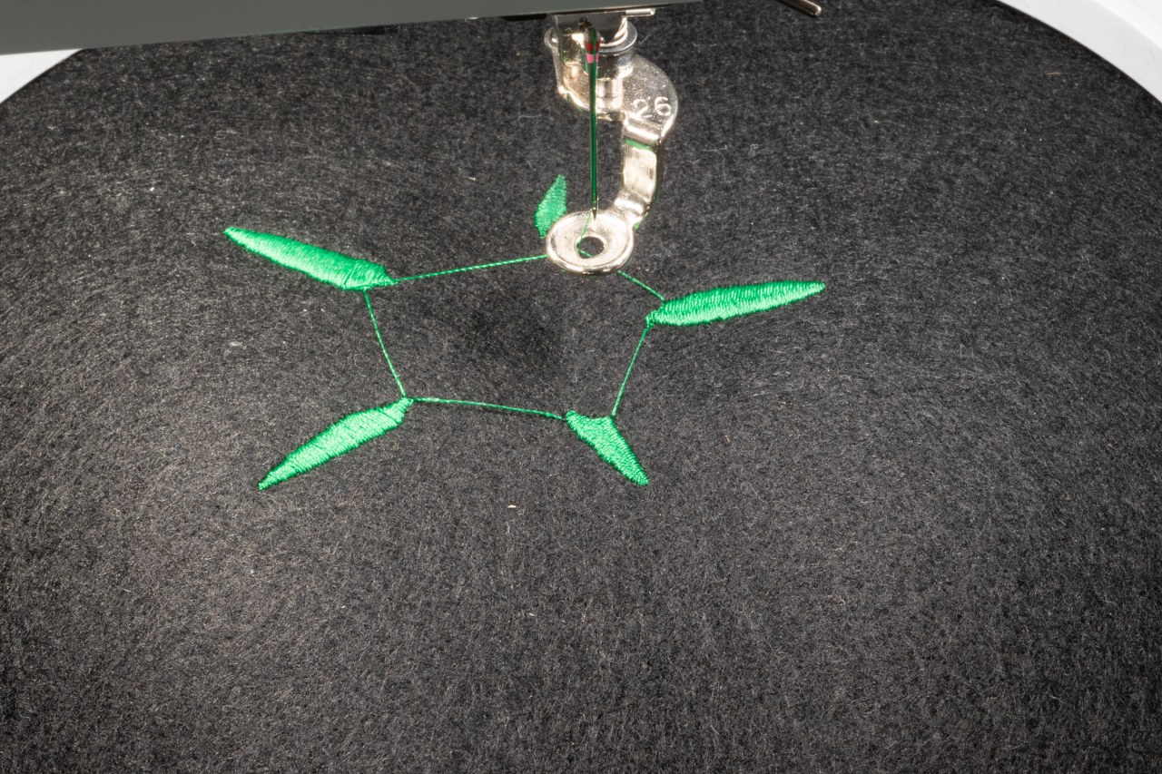
In reality, the edelweiss is a complex mix of lumps, bumps and textures. They often have several layers of highly irregular petals that are a bit furry. Rather than starting with a photograph, I used an already simplified .svg as a starting point for the design and got to work.
There was some thinking required just to digitise this in the right order to get the petals to layer correctly and to deal with the central floret pods which threatened to be a nightmare of stitch density. In keeping with the .svg style, I do have a satin stitch outline but this is worked as a proper fill rather than just as an outline. It does take longer but, unless you have a reason to want something worked in a very regular thickness, I think it gives a more ‘natural’ calligraphic style edging to the shape. Hatch has recently added a new feature for a ‘calligraphy brush’ style satin line, that tries to mimic the varying thickness you’d create with an angled nib but, at the risk of sounding like John Deer, sometimes the manual tools do give you a much better result.
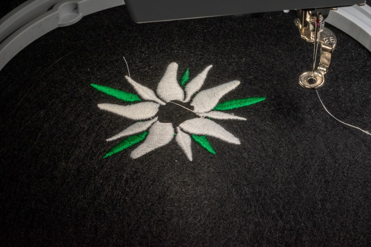
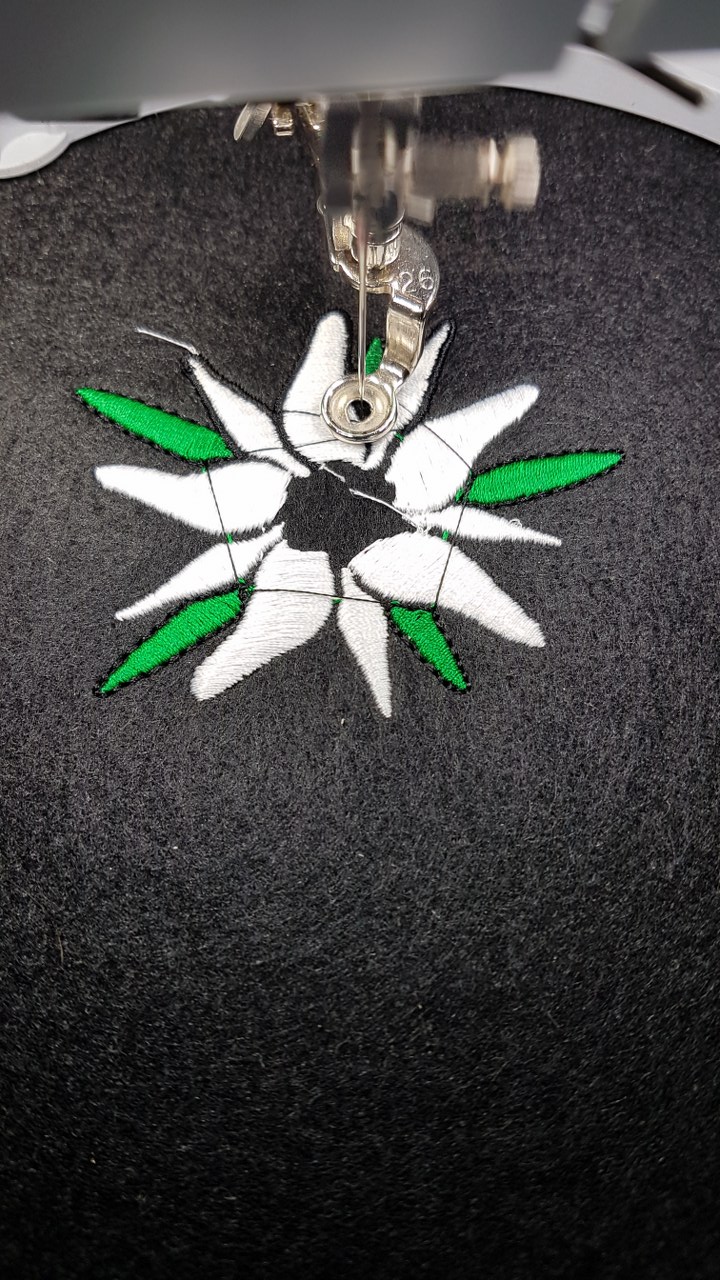
The floret pods are filled in satin with a triple run outline and I did make use of Hatch’s auto-create circle. It usually does a nice job as the auto-push-pull compensation seems to be fairly accurate on the relatively heavy and stable felt. The stitch density did get higher in this region than I would have liked but the needle did plough in through with minimal grumbling.
I let the stitch lengths get as long as they wanted for this and put the density up to get good coverage and really give a smooth bright finish to the flower. Overall, I’m really pleased with how this one went. I wish I could have come up with a more creative solution to the pods on the inside (they feel perfect for some French knots!) but I’d describe it as simple but effective.
The final part of the fun was making the card design look more finished with a message and a perfect excuse to explore the fun of fonts in Hatch. There are two approaches to doing lettering smoothly, either digitising each letter manually or making use of ESA fonts.
John Deer has published a lengthy article on the topic as to why ESA fonts are so great and I can definitely attest to how easy and quick they are to implement in a design as well. What’s nice about ESA fonts is they are ‘object based’ not simply digitised at a given size. (For those of you familiar with the difference between .svg and .jpeg, .bmp etc. file formats – the difference between ESA and other font types is very similar). What this means is you can rescale, distort and mess around to your heart’s content and not worry about causing any hiccups when the design runs.

This is a font called ‘Antique Rose’ and apart from a stupid moment where I missed a colour change and couldn’t face unpicking it, it looks great and Hatch did prove very helpful with tools to get the curvature looking natural and the letter placement. Very pleased. Perhaps I need to start sending haikus by post – letters might take too long to run out on the machine!

That is a lovely embroidery and a lovely card! Thanks for sharing your process – really interesting!
LikeLiked by 1 person
Twain could be a bit unnecessarily harsh at times, couldn’t he. You’ve created a delightful Edelweiss – and it took me several Hard Stares to find the bit you mentioned..
LikeLiked by 1 person
Thank you 🙂
LikeLike